"+/-"
guest blogger Sandy Hunter
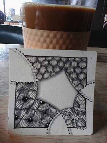
"Flying Birds" string
tangles-"Dugwud", "Olb" & "Sandswirl"
It's a very chill Monday morning at the cafe today. After a very busy week at the market, it's my day off and I'm drinking my coffee and enjoying the comfort of a foggy San Francisco morning.
The Diva challenge this week is put forth by guest blogger Sandy Hunter of Tanglebucket. The idea is to embrace the negative space. I'm using one of my favorite string ideas, it's super versatile and I just love the way it breaks up the space... Margaret Bremner's "Flying Birds". I used the same string layout for the "Simplicity" challenge, but you can lay those birds down in any way you want. I used a couple of my "mac & cheese" patterns.
I'm not the only one doing art at this cafe. I found a box labeled "Bookmarks" on the cafe's bookshelf this morning. I refrained from taking more, but I took these three:
"Found Art"
bookmarks from the cafe
I think it's acrylic and the line work is imprinted. This is so cool. I'm not sure who the artist is, but I have an idea.
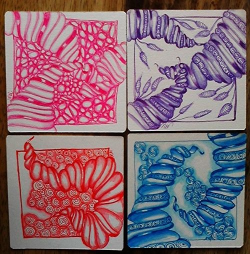
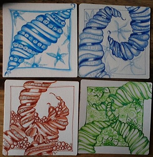
These are tiles I created last week for the Zentangle Artists Trading Card Swap this month. The challenge is to use one color and three tangles per tile. This is way out of my comfort zone because I generally don't do my principal line work in color. We could have used black, but I decided to challenge myself, which included learning "Narwal". It wasn't necessary to use the same patterns for each tile, but I chose to focus on "Narwal". It made the project go a lot faster not having to reinvent the wheel with each tile either and now I think I've found a new "mac & cheese" pattern;-)
I found two inexpensive sets of colored pens at my favorite Japanese $1.50 store so I could experiment without breaking the bank. I did the shading with my Aquarelle watercolor pencils.
Thank you for stopping by! I love all of the wonderful comments you leave:-)


Such a dynamic tile!
ReplyDeleteThank you!
Deletei like these white aréas that go out of the tile. Beautiful.
ReplyDeleteThank you Christine!
DeleteWOW! This is a beautyful tile for the diva challenge. I love your shading. And your colourful compositions of Narwal are just fun.
ReplyDeleteThanks so much Trixie!
DeleteSuper use of negative space. Those ATC's are delightful!
ReplyDeleteI really like placement of your negative space. Quite dramatic!
ReplyDeleteThanks Yukari!
DeleteOh wow! Your tile for the Diva challenge looks great!
ReplyDeleteI love your challenge tile, the design is beautiful and strong. Your Narwal tiles are so very well done, I still don't master Narwal.
ReplyDeleteThanks Anne! There are a couple of great You Tube videos I watched over and over and just kept drawing over and over. This one definitely takes some practice;-)
DeleteLove the flying birds exercise ! And your narwals!!!! FaBU-lous
ReplyDeleteVery creative tile for the diva challenge! I like how the white breaks the frame :-)
ReplyDeleteThank you Sandra!
DeleteThose artist trading cards are wonderful and I really admire your shading. I feel ashamed now that I haven't used my Aquarelle pencils much. So that's my next challenge.
ReplyDeleteThanks Margaret! I dragged this Aquarelle set out of a box of old art school supplies from like...20 years ago. I had never used them. Now I'd be lost without them ;-)
DeleteNice job and the Diva tile - I like the contrast of the dark tangling and the white space.
ReplyDeleteGreat ATC's! Love your theme. Your Diva tile was well thought out and drawn so well! Sarah.
ReplyDeleteI have not seen the "flying birds" string before, but it really works beautifully for this challenge. What a wonderful tile! Your many-colored Narwal are gorgeous. Together they make a fabulous display. You should frame them together. Love it!
ReplyDeleteThanks Antonine! The Narwals are going out into the world for a swap;-) I'm gonna miss them.
DeleteBeautiful challenge tile with great choice of tangle and perfect use of the white spaces! Your Narwal collection is fabulous! Very nicely done!
ReplyDeleteThank you Annette!
DeleteIt's awesome how you think out of the box with the diva challenge!
ReplyDeleteThe white space seemst to grow further and further this way!
Like the colored backgrounds very much!
Thank you Ilse!
DeleteLovely, lovely Diva challenge tile. For some reason, I couldn´t see all the other tiles you did apart from the Narwla ones, which are spectacular! Is it just my imagination, or do one or two look temptingly like a stack of marcaroons....?
ReplyDeleteAxxx
Thank you Annie! They do look like macaroons now that you mention it;-)
DeleteLots of cool stuff to look at! I love both the Diva challenge and all the trading card designs.
ReplyDeleteThank you Karen Lynn!
Delete